
Challenge
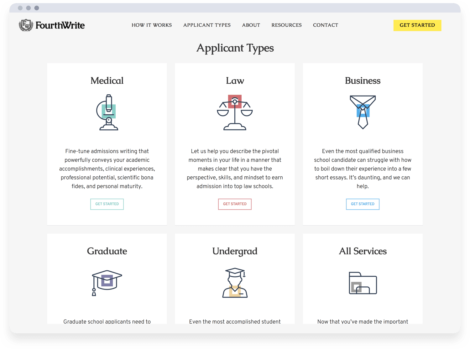
FourthWrite has a wide range of expertise, serving applicants from both undergraduate and graduate programs in the medical, law, and business fields. These separate but overlapping user journeys needed to be thoughtfully streamlined, so they could passively receive orders and focus on the service itself.

How
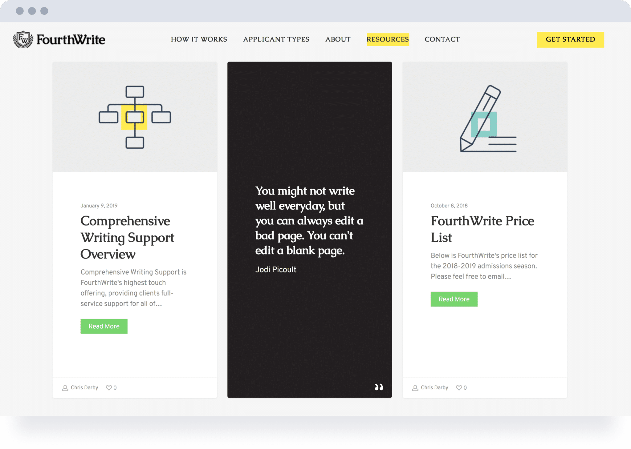
Of course, we started with branding. As the name implies, Fourthwrite is genuine, thoughtful, and direct. We refreshed and expanded the brand’s visual language to be founded on a custom, color-coded icon set that would provide consistency and differentiation between their services.
Applying this to the order experience provided immediately clear user journeys. Our design and development focused on simplifying the process of service requests by answering questions and filtering options along the way. The result is a tight e-commerce site that feels closer to being an app.
"They took time to understand our business and its attendant website needs, and brought keen insights into both design and user interface that greatly improved our web presence."
Christopher DarbyCEO, FourthWrite
Provided for FourthWrite
- Industry Research
- Analytics & Insights
- Design System
- Icon Set
- UX / UI (Web)
- Web Development
